
Graphical Data Representation with Python – Matplotlib: Part Two
In the previous article, I talked about matplotlib for drawing generic curves; in this one, I will show how to draw scatter plots, histograms, and time series.
| I remind you that for the following examples, I will use Jupyter notebook. Therefore, if you’re not familiar with it, I invite you to take a look at this article. |
Creating the Jupyter Notebook Project
Open a shell, create a new directory, and run the command jupyter notebook
mkdir EXAMPLE
cd EXAMPLE/
jupyter notebook
A browser window will open.
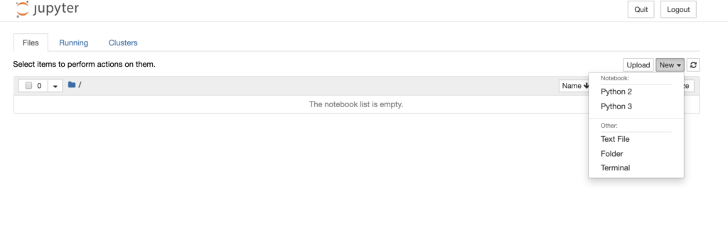
At this point, select the Python 3 interpreter to initialize the environment.

Scatter Plots
First, let’s import the necessary libraries:
import pandas as pd
import numpy as np
import matplotlib.pyplot as plt
To generate points in the scatter space, we use numpy.
#Generating random points
randomPoints=np.random.randn(100,2);
| np.random.randn returns samples in the scatter space.
If positive integer arguments are provided, randn generates an array (d0, d1, …, dn), filled with random floats sampled from a “normal” (Gaussian) distribution with a mean of 0 and variance of 1. If no arguments are provided, a single random float sample from the standard distribution will be returned. |
The previous instruction will generate 100 random points. The result will look something like this:
array([[-0.28393081,  1.69444015],
       [ 1.18710769,  0.75168393],
       [-1.08797599,  0.16593107],
       [ 0.34718794,  1.50584947],
       [ 0.59907203,  0.34574815],
       [-1.17150305,  1.32782198],
       [-0.66961386,  0.13941936],
       [ 0.96038988, -0.04362326],
       [-0.42828503, -1.35202516],
       [-0.57520301, -0.5182515 ]])
At this point, we can create the dataframe that we will use as a parameter for matplotlib’s pyplot.
df = pd.DataFrame(randomPoints,columns=['x', 'y'])
And print the scatter plot:
plt.plot(df['x'],df['y'],'.')

Complete Example

If we wanted to represent more prominent points, we could use the “o” print option instead of “.”
plt.plot(df['x'],df['y'],'o')

Other options can allow us to create more meaningful plots, defining the size of the points and the color, but to do this, we will need to use the scatter function instead of plot.
Note: For our example, we will also use random data for the colors and the size of the points;
random_color=np.random.randn(100)
random_point_size=1000*np.random.randn(100)
plt.scatter(df['x'],df['y'],s=random_point_size,alpha=0.6,c=random_color)

I am passionate about technology and the many nuances of the IT world. Since my early university years, I have participated in significant Internet-related projects. Over the years, I have been involved in the startup, development, and management of several companies. In the early stages of my career, I worked as a consultant in the Italian IT sector, actively participating in national and international projects for companies such as Ericsson, Telecom, Tin.it, Accenture, Tiscali, and CNR. Since 2010, I have been involved in startups through one of my companies, Techintouch S.r.l. Thanks to the collaboration with Digital Magics SpA, of which I am a partner in Campania, I support and accelerate local businesses.
Currently, I hold the positions of:
CTO at MareGroup
CTO at Innoida
Co-CEO at Techintouch s.r.l.
Board member at StepFund GP SA
A manager and entrepreneur since 2000, I have been:
CEO and founder of Eclettica S.r.l., a company specializing in software development and System Integration
Partner for Campania at Digital Magics S.p.A.
CTO and co-founder of Nexsoft S.p.A, a company specializing in IT service consulting and System Integration solution development
CTO of ITsys S.r.l., a company specializing in IT system management, where I actively participated in the startup phase.
I have always been a dreamer, curious about new things, and in search of “new worlds to explore.”
Comments